前言
本文章不会再更新,之后的所有更改可以在下面仓库的 commits 中查看:
::github{repo=“Shizuku-in/Mizuki”}
BackToTop 按钮修复
问题
在摸索的时候发现了一个小漏洞,在任意一篇文章中一旦触发了 BackToTop 按钮,即使回到顶部,该按钮仍然不会消失,如图所示:

原因
在 /src/layouts/Layout.astro 中,showBackToTopThreshold 的计算逻辑有点问题,很多页面中都非常有可能会出现负值,这就导致了 scrollTop > showBackToTopThreshold 恒成立,会一直显示该按钮。
解决方法
:::important[NOTE] PR 被合并后该 Bug 已修复,不过仍可以通过下面的方法添加动画。 :::
可以把 contentWrapper 判断逻辑中 showBackToTopThreshold 的计算方式改为 showBackToTopThreshold = absoluteTop + window.innerHeight / 4 来解决。
也可以创建一个 handleScroll 函数并添加添加事件监听来解决:
function handleScroll() {
        // 便于演示这里使用了 300
        // 实际操作可以将 \src\layouts\Layout.astro 中计算好的 showBackToTopThreshold 存储到文档根元素的数据属性
        // 然后再在该处读取文档根元素以替换 300
        if (window.scrollY > 300) {
            backToTopBtn.classList.remove('hide');
        } else {
            backToTopBtn.classList.add('hide');
        }
    }

window.addEventListener('scroll', handleScroll);

handleScroll(); // 初始化时也检查一次
另外,该按钮的出现和消失没有任何动画,显得十分生硬,我便添加了淡入淡出动画,可以选择使用下面的代码直接替换 BackToTop.astro:
---
import { Icon } from "astro-icon/components";
---

<!-- There can't be a filter on parent element, or it will break `fixed` -->
<div class="back-to-top-wrapper block">
    <div id="back-to-top-btn" class="back-to-top-btn flex items-center rounded-2xl overflow-hidden transition">
        <button aria-label="Back to Top" class="btn-card h-[3.75rem] w-[3.75rem]">
            <Icon name="material-symbols:keyboard-arrow-up-rounded" class="mx-auto"></Icon>
        </button>
    </div>
</div>

<style lang="stylus">
  .back-to-top-wrapper
    width: 3.75rem
    height: 3.75rem
    position: absolute
    right: 0
    top: 0
    pointer-events: none

  .back-to-top-btn
    color: var(--primary)
    font-size: 2.25rem
    font-weight: bold
    border: none
    position: fixed
    bottom: 3rem
    right: 1rem
    cursor: pointer

    opacity: 0
    transform: scale(0.9)
    pointer-events: none
    transition: all 0.3s ease-in-out

    i
      font-size: 1.75rem

    &.show
      transform: scale(1)
      opacity: 1
      pointer-events: auto

    &:active
      transform: scale(0.9)

  @media (max-width: 1560px)
    .back-to-top-btn
      box-shadow: none

  // 手机端隐藏返回顶部按钮
  @media (max-width: 768px)
    .back-to-top-wrapper
      display: none
</style>

<script is:inline>
    function initBackToTop() {
        const backToTopBtn = document.getElementById("back-to-top-btn");
        if (!backToTopBtn) return;

        backToTopBtn.onclick = () => {
            window.scroll({top: 0, behavior: 'smooth'});
        };

        const handleScroll = () => {
            if (window.scrollY > 300) {
                backToTopBtn.classList.add("show");
            } else {
                backToTopBtn.classList.remove("show");
            }
        };

        window.addEventListener("scroll", handleScroll);

        setTimeout(() => {
            handleScroll();
        }, 100);
    }

    initBackToTop();

    document.addEventListener('astro:page-load', initBackToTop);
</script>注意,由于我没有使用音乐播放器,便将按钮的位置下移了一部分,请按你的需求自行更改 .back-to-top-btn 中 bottom 和 right 的值。
添加 FloatingTOC 按钮的淡入淡出
问题
我比较喜欢悬浮按钮模式的目录,但是居然又没有任何动画!并且,如果在主页的底部点进一篇文章的瞬间,统计阅读的进度条会莫名其妙抽风,真的让人忍不了…
于是又定位到组件 /src/components/control/FloatingTOC.astro,开始爆改…
解决方法
添加了跟 BackToTop 按钮一样的淡入淡出动画(替换为 hasContent 判断逻辑实现),可以选择将下面的代码直接替换 FloatingTOC.astro:
---
import { Icon } from "astro-icon/components";
import { siteConfig } from "../../config";
const tocDepth = siteConfig.toc.depth;
const useJapaneseBadge = siteConfig.toc.useJapaneseBadge;
---
<div
class="floating-toc-wrapper"
data-depth={tocDepth}
data-japanese-badge={useJapaneseBadge}
>
<button
id="floating-toc-btn"
class="floating-toc-btn btn-card"
aria-label="Table of Contents"
>
<svg
class="progress-ring"
width="100%"
height="100%"
viewBox="0 0 100 100"
>
<circle
class="progress-ring-circle"
cx="50"
cy="50"
r="40"
fill="transparent"></circle>
</svg>
<div class="btn-icon">
<Icon
name="material-symbols:format-list-bulleted-rounded"
class="text-2xl"
/>
</div>
</button>
<div id="floating-toc-panel" class="floating-toc-panel">
<div class="floating-toc-panel-content" id="floating-toc-content"></div>
</div>
</div>
<style>
.floating-toc-wrapper {
position: fixed;
right: 1rem;
bottom: 8rem;
z-index: 50;
opacity: 0;
transform: scale(0.9);
pointer-events: none;
transition: all 0.3s ease-in-out;
}
.floating-toc-wrapper.show-widget {
opacity: 1;
transform: scale(1);
pointer-events: auto;
}
.floating-toc-btn {
width: 3.75rem;
height: 3.75rem;
border-radius: 1rem;
display: flex;
align-items: center;
justify-content: center;
color: var(--primary);
position: relative;
background: var(--card-bg);
cursor: pointer;
}
.floating-toc-btn.active {
background: var(--btn-card-bg-active);
}
.progress-ring {
position: absolute;
top: 0;
left: 0;
transform: rotate(-90deg);
pointer-events: none;
z-index: 0;
}
.progress-ring-circle {
stroke: var(--primary);
stroke-width: 5;
stroke-dasharray: 251.2;
stroke-dashoffset: 251.2;
transition: stroke-dashoffset 0.1s linear;
stroke-linecap: round;
}
.btn-icon {
z-index: 1;
position: relative;
}
.floating-toc-panel {
position: absolute;
bottom: 4.5rem;
right: 0;
width: 18rem;
max-height: 60vh;
background: var(--card-bg);
border: 1px solid var(--line-color);
border-radius: 1rem;
box-shadow: 0 4px 20px rgba(0, 0, 0, 0.15);
overflow: hidden;
opacity: 0;
visibility: hidden;
transform: translateY(10px) scale(0.95);
transition: all 0.2s ease;
pointer-events: none;
}
.floating-toc-panel.show {
opacity: 1;
visibility: visible;
transform: translateY(0) scale(1);
pointer-events: auto;
}
.floating-toc-panel-content {
padding: 0.75rem;
max-height: 60vh;
overflow-y: auto;
overflow-x: hidden;
}
.floating-toc-panel-content::-webkit-scrollbar {
width: 4px;
}
.floating-toc-panel-content::-webkit-scrollbar-track {
background: transparent;
}
.floating-toc-panel-content::-webkit-scrollbar-thumb {
background: var(--line-color);
border-radius: 2px;
}
@media (max-width: 1560px) {
.floating-toc-btn {
box-shadow:
0 0 0 1px var(--btn-regular-bg),
0 0 1em var(--btn-regular-bg);
}
}
@media (max-width: 768px) {
.floating-toc-wrapper {
right: 2rem;
bottom: 2rem;
}
.floating-toc-panel {
width: 85vw;
max-width: 20rem;
right: 0;
bottom: 4.5rem;
}
}
:global(.floating-toc-item) {
display: flex;
align-items: center;
padding: 0.5rem;
color: var(--text-secondary);
text-decoration: none;
font-size: 0.9rem;
line-height: 1.5;
border-radius: 0.5rem;
transition: all 0.2s;
}
:global(.floating-toc-item:hover) {
background-color: var(--btn-regular-bg);
color: var(--primary);
}
:global(.floating-toc-item.active) {
background-color: var(--btn-card-bg-active);
color: var(--primary);
font-weight: 500;
}
:global(.floating-toc-badge) {
display: inline-flex;
align-items: center;
justify-content: center;
width: 1.25rem;
height: 1.25rem;
background: var(--btn-regular-bg);
color: var(--primary);
border-radius: 0.25rem;
font-size: 0.75rem;
font-weight: bold;
margin-right: 0.5rem;
flex-shrink: 0;
}
:global(.floating-toc-dot) {
width: 0.5rem;
height: 0.5rem;
background: var(--line-divider);
border-radius: 50%;
margin-right: 0.75rem;
margin-left: 0.375rem;
flex-shrink: 0;
}
:global(.floating-toc-dot-small) {
width: 0.35rem;
height: 0.35rem;
background: var(--line-divider);
border-radius: 50%;
margin-right: 0.75rem;
margin-left: 0.45rem;
flex-shrink: 0;
}
:global(.floating-toc-item.active .floating-toc-dot),
:global(.floating-toc-item.active .floating-toc-dot-small) {
background: var(--primary);
}
:global(.floating-toc-text) {
overflow: hidden;
text-overflow: ellipsis;
white-space: nowrap;
}
</style>
<script>
class FloatingTOC {
private btn: HTMLElement | null;
private panel: HTMLElement | null;
private content: HTMLElement | null;
private wrapper: HTMLElement | null;
private isOpen = false;
private observer: MutationObserver | null = null;
private headings: HTMLElement[] = [];
private hasContent = false;
constructor() {
this.btn = document.getElementById("floating-toc-btn");
this.panel = document.getElementById("floating-toc-panel");
this.content = document.getElementById("floating-toc-content");
this.wrapper = document.querySelector(".floating-toc-wrapper");
this.init();
}
private init() {
const onScroll = () => {
this.updateProgress();
this.updateActiveHeading();
this.checkVisibility();
};
window.addEventListener("scroll", onScroll, { passive: true });
window.addEventListener(
"resize",
() => {
this.updateActiveHeading();
this.updateProgress();
},
{ passive: true },
);
this.bindEvents();
this.generateTOC();
this.observeContent();
this.updateProgress();
setTimeout(() => {
this.checkVisibility();
}, 100);
}
private checkVisibility() {
if (!this.wrapper) return;
if (this.hasContent) {
this.wrapper.classList.add("show-widget");
} else {
this.wrapper.classList.remove("show-widget");
}
}
private observeContent() {
const contentWrapper = document.getElementById("post-container");
if (contentWrapper) {
this.observer = new MutationObserver(() => {
this.generateTOC();
this.updateProgress();
});
this.observer.observe(contentWrapper, {
childList: true,
subtree: true,
});
}
}
private updateProgress() {
if (!this.btn) return;
const scrollTop =
window.scrollY || document.documentElement.scrollTop;
const docHeight =
document.documentElement.scrollHeight -
document.documentElement.clientHeight;
const scrollPercent = docHeight > 0 ? scrollTop / docHeight : 0;
const circle = this.btn.querySelector(
".progress-ring-circle",
) as SVGCircleElement;
if (circle) {
const radius = circle.r.baseVal.value;
const circumference = radius * 2 * Math.PI;
const offset = Math.max(
0,
Math.min(
circumference,
circumference - scrollPercent * circumference,
),
);
circle.style.strokeDashoffset = offset.toString();
}
}
private updateActiveHeading() {
if (!this.content || this.headings.length === 0) return;
const scrollY = window.scrollY;
const offsetTop = 150;
let activeIndex = -1;
for (let i = 0; i < this.headings.length; i++) {
const heading = this.headings[i];
if (
heading.getBoundingClientRect().top + scrollY <
scrollY + offsetTop
) {
activeIndex = i;
} else {
break;
}
}
const links = Array.from(
this.content.querySelectorAll(".floating-toc-item"),
);
links.forEach((link, index) => {
if (index === activeIndex) {
link.classList.add("active");
if (this.isOpen) {
const panelContent = this.content;
if (panelContent) {
const linkEl = link as HTMLElement;
const panelRect =
panelContent.getBoundingClientRect();
const linkRect = linkEl.getBoundingClientRect();
if (
linkRect.top < panelRect.top ||
linkRect.bottom > panelRect.bottom
) {
linkEl.scrollIntoView({ block: "nearest" });
}
}
}
} else {
link.classList.remove("active");
}
});
}
private generateTOC() {
const container = document.getElementById("post-container");
if (!container) {
this.hasContent = false;
this.wrapper?.classList.remove("active-toc");
this.wrapper?.classList.add("no-toc");
this.checkVisibility();
return;
}
const allHeadings = container.querySelectorAll(
"h1[id], h2[id], h3[id], h4[id], h5[id], h6[id]",
);
if (allHeadings.length === 0) {
this.hasContent = false;
this.wrapper?.classList.remove("active-toc");
this.wrapper?.classList.add("no-toc");
this.headings = [];
this.checkVisibility();
return;
}
this.hasContent = true;
this.wrapper?.classList.remove("no-toc");
this.wrapper?.classList.add("active-toc");
this.headings = [];
const maxLevel = parseInt(this.wrapper?.dataset.depth || "3");
const useJapaneseBadge =
this.wrapper?.dataset.japaneseBadge === "true";
const japaneseKatakana = [ "ア", "イ", "ウ", "エ", "オ", "カ", "キ", "ク", "ケ", "コ", "サ", "シ", "ス", "セ", "ソ", "タ", "チ", "ツ", "テ", "ト", "ナ", "ニ", "ヌ", "ネ", "ノ", "ハ", "ヒ", "フ", "ヘ", "ホ" ];
let minLevel = 6;
allHeadings.forEach((h) => {
const level = parseInt(h.tagName[1]);
if (level < minLevel) minLevel = level;
});
let html = "";
let h1Count = 0;
allHeadings.forEach((heading) => {
const level = parseInt(heading.tagName[1]);
if (level >= minLevel + maxLevel) return;
this.headings.push(heading as HTMLElement);
const indent = (level - minLevel) * 1;
let badge = "";
if (level === minLevel) {
h1Count++;
const badgeText =
useJapaneseBadge &&
h1Count - 1 < japaneseKatakana.length
? japaneseKatakana[h1Count - 1]
: h1Count.toString();
badge = `<span class="floating-toc-badge">${badgeText}</span>`;
} else if (level === minLevel + 1) {
badge = '<span class="floating-toc-dot"></span>';
} else {
badge = '<span class="floating-toc-dot-small"></span>';
}
const text = (heading.textContent || "").replace(/#+\s*$/, "");
html += `<a href="#${heading.id}" class="floating-toc-item" style="padding-left: ${0.5 + indent}rem" data-level="${level - minLevel}">${badge}<span class="floating-toc-text">${text}</span></a>`;
});
if (this.content) {
this.content.innerHTML = html;
}
this.checkVisibility();
this.updateActiveHeading();
}
private bindEvents() {
this.btn?.addEventListener("click", (e) => {
e.stopPropagation();
this.toggle();
});
document.addEventListener("click", (e) => {
if (this.isOpen && !this.wrapper?.contains(e.target as Node)) {
this.close();
}
});
this.content?.addEventListener("click", (e) => {
const link = (e.target as HTMLElement).closest("a");
if (link) {
e.preventDefault();
const id = link.getAttribute("href")?.slice(1);
if (id) {
const element = document.getElementById(id);
if (element) {
const top =
element.getBoundingClientRect().top +
window.scrollY -
80;
window.scrollTo({ top, behavior: "smooth" });
this.close();
}
}
}
});
document.addEventListener("keydown", (e) => {
if (e.key === "Escape" && this.isOpen) this.close();
});
if ((window as any).swup) {
(window as any).swup.hooks.on("page:view", () => {
setTimeout(() => this.reinit(), 200);
});
}
}
private toggle() {
this.isOpen ? this.close() : this.open();
}
private open() {
this.isOpen = true;
this.panel?.classList.add("show");
this.btn?.classList.add("active");
this.wrapper?.classList.add("active");
}
private close() {
this.isOpen = false;
this.panel?.classList.remove("show");
this.btn?.classList.remove("active");
this.wrapper?.classList.remove("active");
}
private reinit() {
if (this.observer) {
this.observer.disconnect();
}
this.close();
this.generateTOC();
this.observeContent();
this.updateProgress();
}
}
document.addEventListener("DOMContentLoaded", () => new FloatingTOC());
document.addEventListener("swup:page:view", () => new FloatingTOC());
document.addEventListener('astro:page-load', () => new FloatingTOC());
</script>同样注意,按需求更改:
.floating-toc-panel中right和bottom的值。@media (max-width: 768px)(手机端)的.floating-toc-wrapper中right和bottom的值。
添加代码块折叠控制
问题
Mizuki 虽然提供了代码块折叠功能,但所有代码块默认都是展开的。对于一些很长的代码示例,在手机端访问时会出现卡顿现象,同时也不便于浏览。
解决方法
添加了一个自定义插件来支持通过代码块的元数据控制默认折叠状态,可以在代码块的语言标识后添加 {collapse} 来让代码块默认折叠。
实现步骤
- 创建插件文件
/src/plugins/expressive-code/collapse-metadata.ts:
import { definePlugin } from "@expressive-code/core";

export function pluginCollapseMetadata() {
    return definePlugin({
        name: "Collapse Metadata",
        hooks: {
            postprocessRenderedBlock: ({ codeBlock, renderData }) => {
                // 检查元数据中是否包含 collapse 标记
                const meta = codeBlock.meta || "";
                const shouldCollapse = meta.includes("collapse");

                if (shouldCollapse && renderData.blockAst.properties) {
                    // 添加 data-collapse 属性到代码块
                    renderData.blockAst.properties["data-collapse"] = "true";
                }
            },
        },
    });
}- 修改
astro.config.mjs,导入并注册插件:
// 在文件顶部添加导入
import { pluginCollapseMetadata } from "./src/plugins/expressive-code/collapse-metadata.ts";

// 在 expressiveCode 配置中添加插件
expressiveCode({
    themes: ["github-light", "github-dark"],
    plugins: [
        pluginCollapsibleSections(),
        pluginLineNumbers(),
        pluginLanguageBadge(),
        pluginCustomCopyButton(),
        pluginCollapseMetadata(),
    ],
    // ...
})- 修改
/src/scripts/code-collapse.js的enhanceCodeBlock方法:
enhanceCodeBlock(codeBlock) {
    const frame = codeBlock.querySelector(".frame");
    if (!frame) {
        this.log("No frame found in code block, skipping");
        return;
    }

    if (frame.classList.contains("has-title")) {
        this.log("Code block has title, skipping collapse feature");
        return;
    }

    this.log("Adding collapse feature to code block");

    // 检查是否有 data-collapse 属性来决定默认状态
    const shouldCollapse = codeBlock.hasAttribute("data-collapse") ||
                           frame.hasAttribute("data-collapse");

    if (shouldCollapse) {
        this.log("Code block has collapse attribute, defaulting to collapsed");
        codeBlock.classList.add("collapsible", "collapsed");
    } else {
        codeBlock.classList.add("collapsible", "expanded");
    }

    const toggleBtn = this.createToggleButton();
    frame.appendChild(toggleBtn);

    this.bindToggleEvents(codeBlock, toggleBtn);
}
现在可以在任何代码块后添加 {collapse} 来让它默认折叠。这样可以让文章更加简洁,同时保留了完整的代码示例供需要的读者查看。
使用方法
在 Markdown 中,只需在代码块的语言标识后添加 {collapse} 即可:
```js {collapse}
// 这个代码块默认会折叠
function example() {
console.log("This code block is collapsed by default");
}
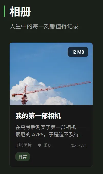
```添加相册大小显示
问题
一个相册往往有大有小,为了不让读者的流量爆炸,所以还是添加一个标识来提醒一下吧(
解决方法
- 在
/src/types/album.ts的AlbumGroup接口中添加大小字段:
export interface AlbumGroup {
    id: string;
    title: string;
    description?: string;
    cover: string;
    date: string;
    location?: string;
    tags?: string[];
    layout?: "grid" | "masonry";
    columns?: number;
    photos: Photo[];
    totalsize?: string;
}- 在
/src/utils/album-scanner.ts中添加读取大小的逻辑:
// 构建相册对象
return {
    id: folderName,
    title: info.title || folderName,
    description: info.description || "",
    cover,
    date: info.date || new Date().toISOString().split("T")[0],
    location: info.location || "",
    tags: info.tags || [],
    layout: info.layout || "grid",
    columns: info.columns || 3,
    photos,
    totalsize: info.totalsize || undefined,
};- 修改
/src/pages/albums.astro中的相册网格 - 封面图片部分以显示大小:
<!-- 相册网格 -->
<div class="grid grid-cols-1 md:grid-cols-2 lg:grid-cols-3 gap-6">
  {albumsData.map(album => (
    <article
      class="album-card group bg-white dark:bg-neutral-900 rounded-lg overflow-hidden shadow-sm hover:shadow-md transition-all duration-300 border border-neutral-200 dark:border-neutral-800"
    >
      <a href={`/albums/${album.id}/`} class="block">
        <!-- 封面图片 -->
        <div class="aspect-[4/3] overflow-hidden bg-neutral-100 dark:bg-neutral-700 relative">
          <img
            src={album.cover}
            alt={album.title}
            class="w-full h-full object-cover group-hover:scale-105 transition-transform duration-300"
            loading="lazy"
          />
          {album.totalsize && (
            <div class="absolute top-3 right-3 bg-black/30 dark:bg-black/70 backdrop-blur-sm px-3 py-1.5 rounded-lg text-white text-xs font-medium shadow-lg">
              {album.totalsize}
            </div>
          )}
        </div>
        // ...
使用方法
可以在 info.json 中添加 totalsize 字段来显示相册大小,如:
{
  "title": "Album",
  "description": "None",
  "date": "2026-01-01",
  "totalsize": "125 MB" // 相册大小
}
效果如下: